Other Projects
Solo Consulting Engagements
The following projects were independent consulting engagements — smaller in scope than Project X, but each involving discovery, user research, design direction, and stakeholder alignment delivered solo. Federal clients, federal stakes, different agencies.
Work shown under NDA. Screenshots are sanitized — names and identifiers replaced with generic placeholders. Design patterns and interaction models are accurate to the real work.
Federal Procurement · Dashboard Design · Data Visualization · Solo Engagement
Regional Confirmation Dashboard — Proactive Compliance Visibility
Step 1 — The Starting State
U.S. consulate offices around the world are required to track and confirm their monthly procurement data — how funds are being used, and a final end-of-month sign-off that the numbers are verified. An unconfirmed consulate at month end isn’t just a missing data point — it’s a real compliance risk.
The existing tool made it nearly impossible to see compliance status proactively. Regional managers could find out which posts were unconfirmed if they looked hard enough, but there was no clear, at-a-glance view across a region. By the time problems were visible, it was usually too late to resolve them before month-end.
Step 2 — Discovery
Two to three targeted user sessions with regional office staff — the people who actually had to follow up with posts — and product owners who understood the compliance requirements. The sessions confirmed that the core need wasn’t reporting. It was action: who do I need to call today, and why?
Step 3 — My Approach
A two-level dashboard. The regional overview shows confirmation status by post as a horizontal bar chart — confirmed vs. unconfirmed — with regions that fall below an 80% threshold surfaced as alerts. Summary cards show total spending, confirmed post count, and unconfirmed count at a glance.
Drilling down into a region opens the post-level detail: FPDS vs. GFMS comparison showing the data gap, a discrepancy table categorized by type (date, vendor name, award type, etc.), and a clear status panel — Unconfirmed, with a “Confirm review” action button. The design is built around making action obvious, not just information visible.
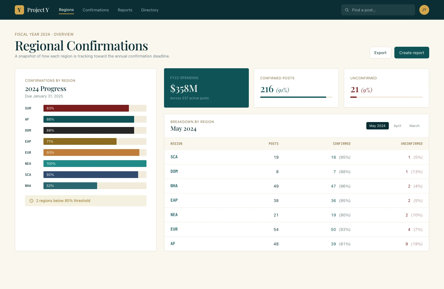
Regional overview — horizontal bar chart by region showing confirmation progress; posts below 80% threshold surfaced as alerts; summary cards show spending, confirmed, and unconfirmed counts
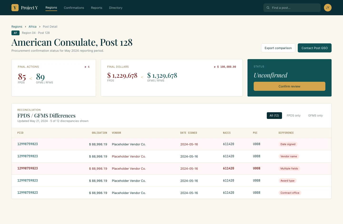
Post-level detail — FPDS/GFMS discrepancy table with difference types categorized; Unconfirmed status with direct “Confirm review” action
Federal Benefits · Portal Design · Filing Workflows · Timeline UX · Solo Engagement
Plan Administration Portal — Pension Filing System Redesign
Step 1 — The Starting State
The existing portal was 15 to 20 years old and hadn’t been designed so much as assembled — a page of centered buttons and text that was semi-functional at best. Plan administrators, plan sponsors, and actuaries used it to create and manage pension plan filings, but the workflow was almost entirely spreadsheet-driven on the user side, with the portal serving as little more than a submission window.
The bigger problem was that once a filing was submitted, users had no clear way to track where it was in the process. They could find out — eventually — but it wasn’t simple. There was real confusion about the workflow itself: how to enter information correctly, where it was going, what happened next.
Step 2 — My Approach
The timeline component was user-requested — they came in explicitly wanting a clear visual indicator of where a filing stood. I worked with that need and shaped it into a status model that showed the full filing journey: completed steps, current position, and what comes next.
Each step in the process has gates: Draft Completion, Actuary Certification, Payment Selection, Administrator Certification, Filing Submission. At each gate, the interface either displays what action is pending and who owns it, or surfaces a direct action button so the user can move things forward. The same timeline component handles both in-progress and submitted states, keeping the mental model consistent regardless of where a filing is.
The portal home was restructured around high-frequency actions — check in-process filings, upload, view plan list — surfaced as prominent quick-action buttons rather than buried in navigation.
I was brought in twice: once to build the initial page set, and again about a year later to add pages for new functionality. The second engagement stayed consistent with the original design system — a good sign the foundation held up in production.
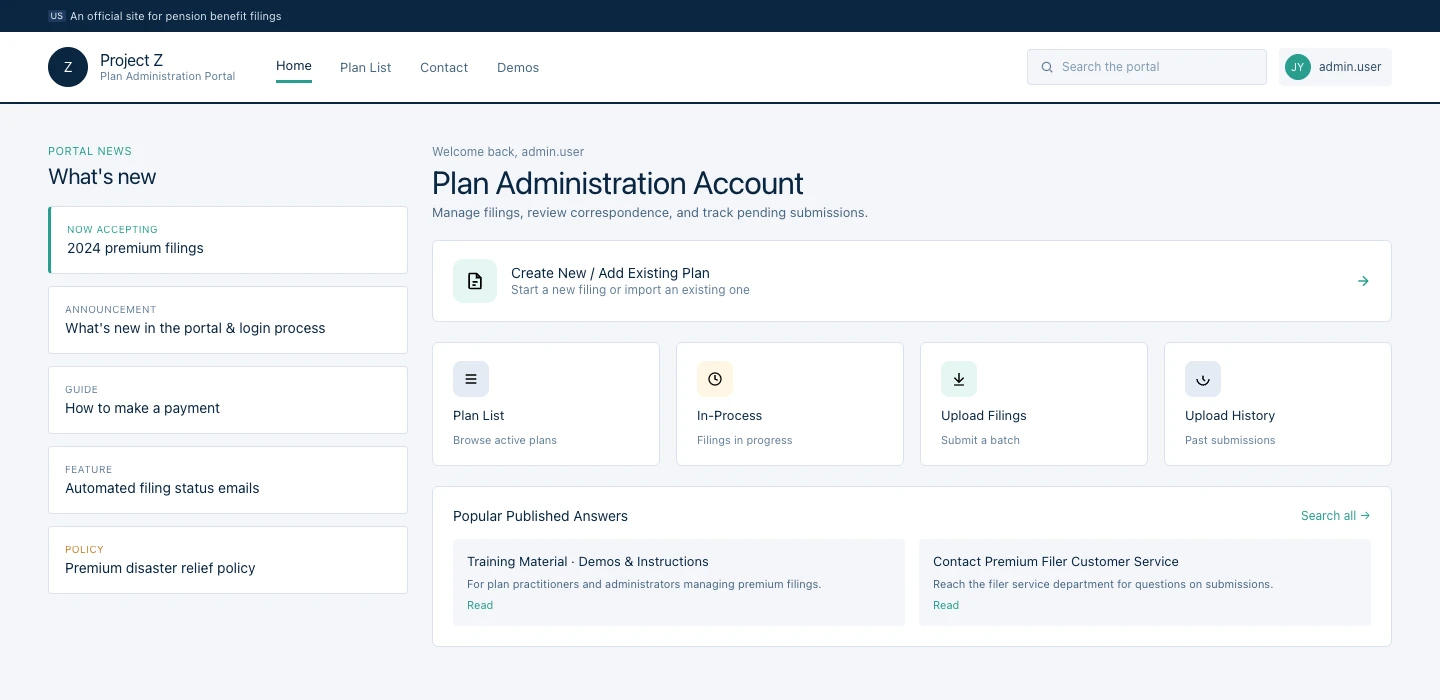
Portal home — news panel with announcements and guides; quick-action buttons (Create Plan, Plan List, In-Process, Upload Filings, Upload History); structured for administrators managing multiple plan filings
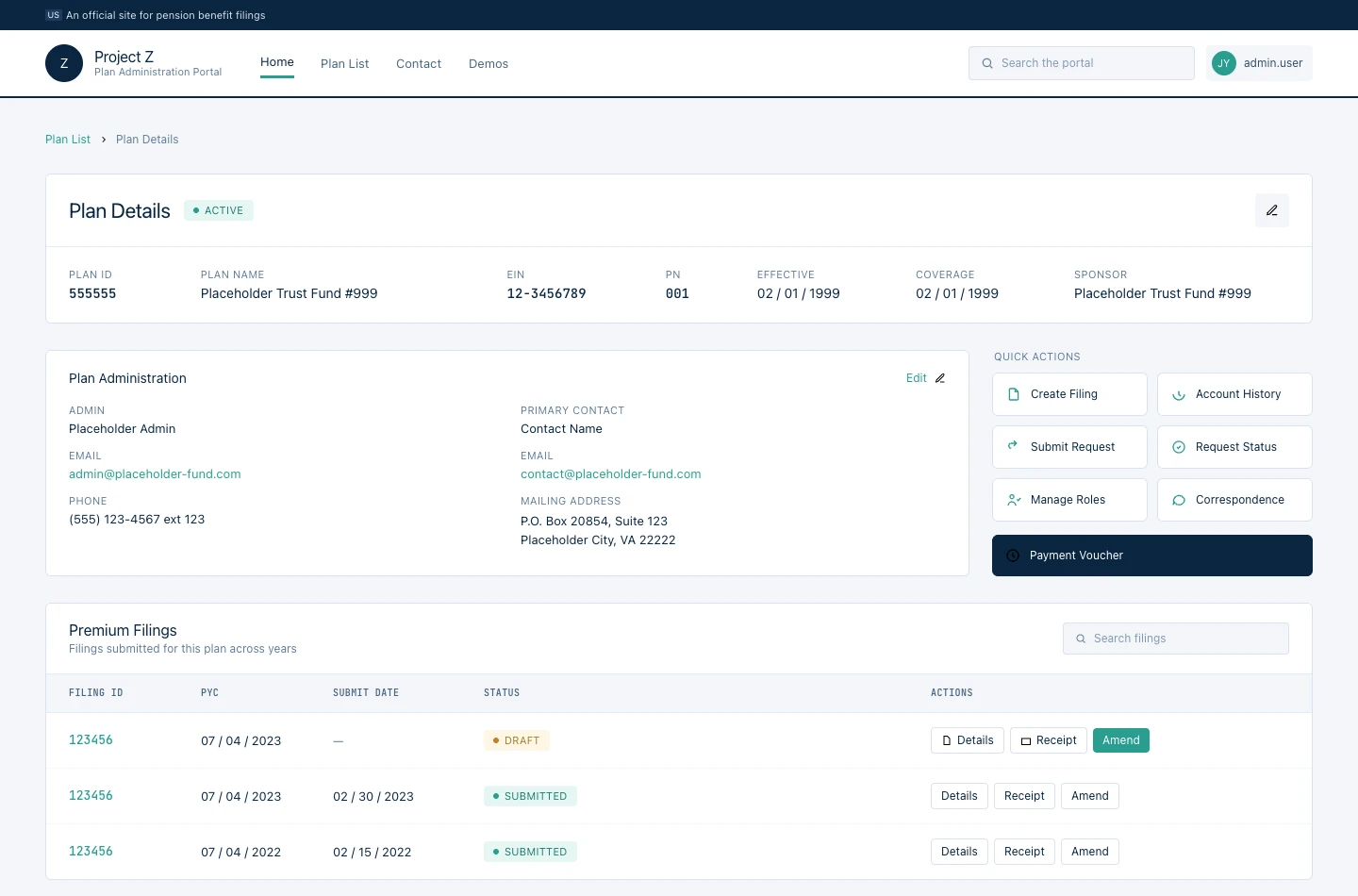
Plan Details — plan identifiers and administration contacts at the top; quick actions to create a filing, manage roles, submit requests; filing history table below
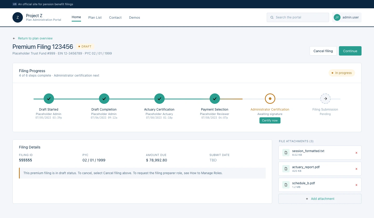
Filing timeline — gate-by-gate status model (Draft Completion → Actuary Certification → Payment Selection → Administrator Certification → Filing Submission); current step shows “Certify now” action; “4 of 6 steps complete” summary
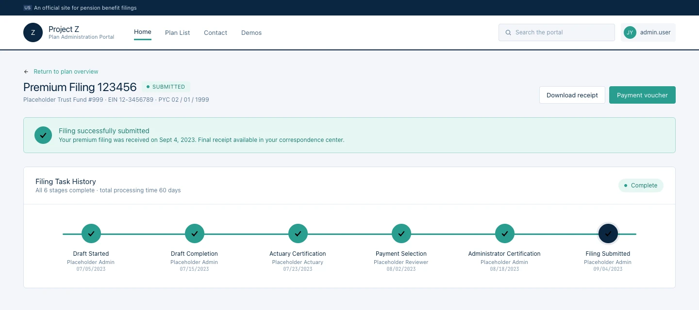
Filing Submitted — same timeline component resolves cleanly to a completed state; all 6 stages marked complete with total processing time; receipt and payment voucher actions surfaced
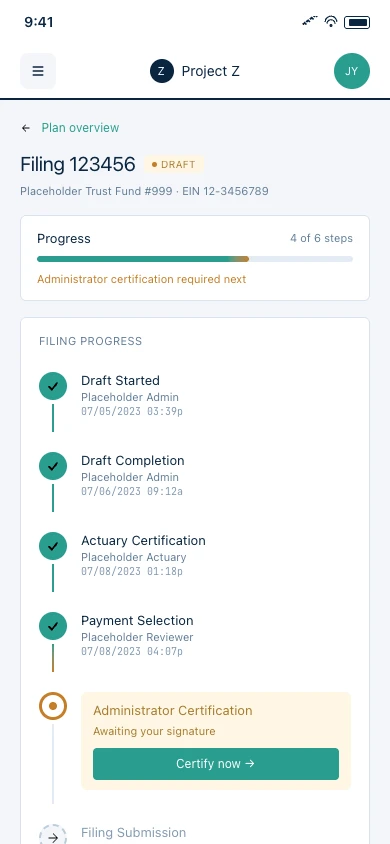
Mobile — the same gate-by-gate timeline stacks vertically on small screens; current step keeps its action button prominent so administrators can certify from any device
Federal Law Enforcement · Case Finance · Data Entry · Solo Engagement
Case Finance Tracker — Field-Level Case Budget Management
Step 1 — The Starting State
Agents working active cases needed to track income, expenses, and offsets against a case budget — and the existing process was almost entirely manual. To log expenses, an agent would upload a credit card statement as a visual reference, then manually key in each line item one by one. The statement and the data entry lived separately; there was no connection between them. For agents juggling multiple cases, this was a significant time drain on work that should have been fast.
Step 2 — Discovery
Multiple SME review sessions with product owners who were former agents and current supervisors. They came in with clear domain knowledge about what they needed to see. The design challenge was mapping established expense-tracking best practices to the specific structure of case finance — income, expenses, offsets and returns, accounting line allocation — and making it fast enough that it didn’t slow down the agents doing the work.
Step 3 — My Approach
The interface is structured around the case as the central object. The case overview leads with a financial summary bar — beginning cash balance, income, expenses, ending balance — so users always have orientation before they act. A sidebar navigates between financial categories (Overview, Income, Expenses, Offsets & Returns, and additional planned sections) without leaving the case context.
For expense entry, a drawer pattern lets agents add and edit line items in a panel over the main view, keeping the case summary visible. For imported statements, parsed line items arrive with system-recommended category assignments; agents move through them quickly — approving, reassigning, or flagging — rather than building each record from scratch.
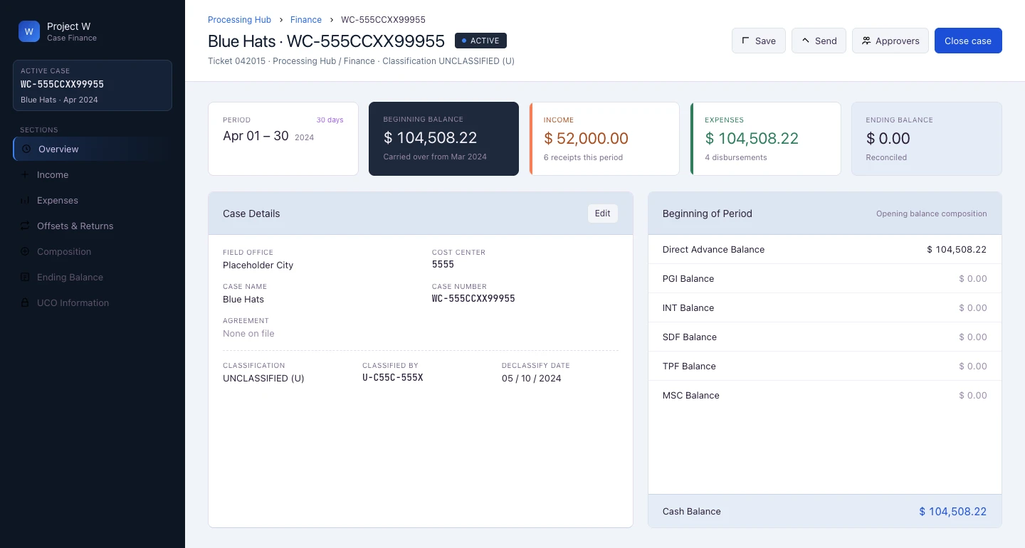
Case overview — financial summary bar (beginning balance, income, expenses, ending balance) with sidebar navigation across income, expenses, offsets, and accounting categories
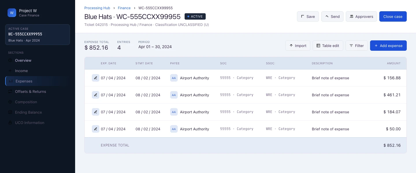
Expenses list view — expense table with date, payee, category codes, and amount; Import and Add Expense actions; full sidebar nav visible showing all case finance sections
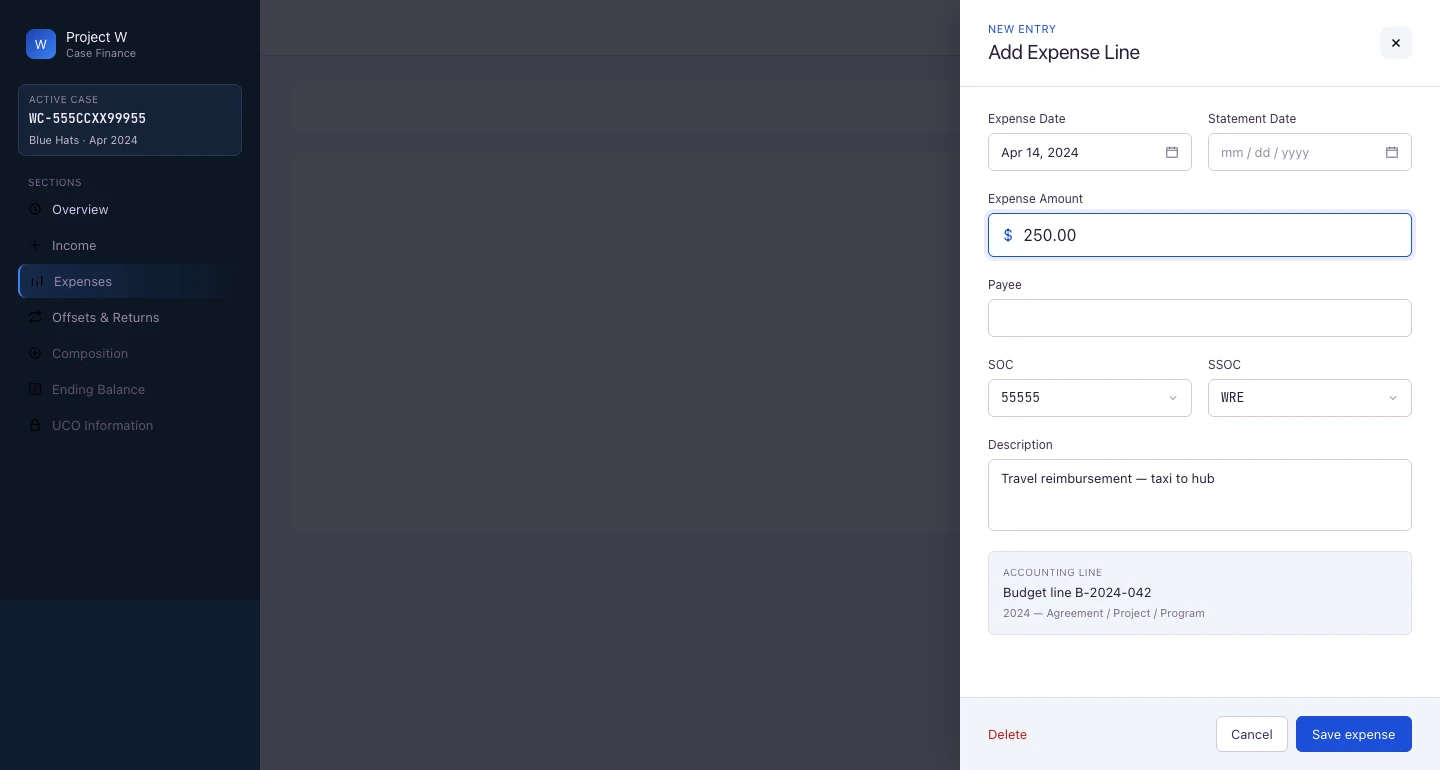
Add Expense Line drawer — in-context entry with case summary visible; accounting line assignment included in the same drawer
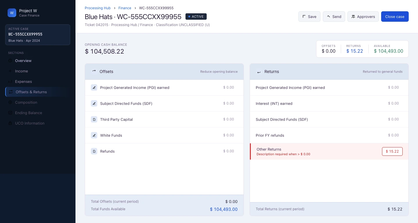
Offsets & Returns — two-column layout showing offsets (left) and returns (right) as distinct financial categories; opening cash balance and available funds surfaced at top; inline validation on Other Returns row
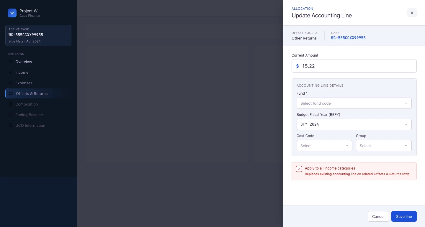
Update Accounting Line drawer — same drawer pattern as expense entry applied to accounting line allocation; Fund, Budget Fiscal Year, Cost Code, and Group fields; “Apply to all income categories” option with explanatory helper text
Want to discuss one of these?
Happy to walk through the decisions, context, and outcomes on a call.