Federal Financial Platform · Enterprise SaaS · UX Lead · Multi-Year Engagement
Federal Financial Platform — Enterprise Acquisition & Budget Management
Work shown under NDA. Screenshots are sanitized — names and identifiers replaced with generic placeholders. Design patterns and interaction models are accurate to the real work.
The Platform
One well-reasoned precedent at a time.
Project X is a federal financial management platform with a 25+ year history — used by more than 50 federal agencies, each running their own instance. It started as a developer-built system and accreted features over decades without a design foundation. By the time the UX modernization engagement began, the platform handled acquisition management, budget execution, payment integrity, task management, and reporting for agencies ranging from small bureaus to major cabinet-level departments.
The modernization didn’t start with a blank slate. It started with a single module — Acquisitions — and built a design system incrementally through real workflow work. Patterns established in one area were then mandated across others. That’s how you move a legacy platform: one well-reasoned precedent at a time.
Working in this environment meant navigating change resistance constantly. The approach: Socratic facilitation. Walk users through their current workflow. Ask them what slows them down. Let them tell you what would make it better. The best designs came from users articulating the problem themselves — not from presenting a solution and defending it.
Sub-case 01 / 06
Dashboard · Financial Intelligence · Budget Monitoring
Data Hub — Financial Intelligence Dashboard
Step 1 — The Problem
Financial managers needed a cross-agency view of budget posture, spending activity, and aging obligations — but the existing reporting tools required navigating into individual records to get any picture of the whole. There was no dashboard-level view of what was healthy, what was at risk, and what needed attention today.
Step 2 — My Approach
The Data Hub is a customizable dashboard built around “watched dimensions” — the budget segments each user cares about. Dimensions approaching or exceeding thresholds surface as alerts. Aging obligations appear as a prioritized list. A trial balance and spend breakdown give users a running orientation to their financial position without requiring them to navigate anywhere.
The Dimension Summary drill-down extends this to a single dimension: burn vs. available over time as a stacked bar chart, with child dimension alerts surfaced in a right-hand panel.
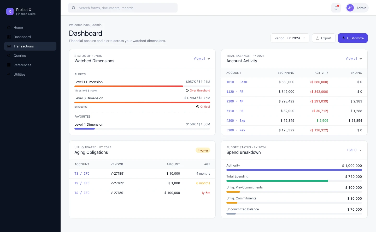
Dashboard overview — watched dimensions with threshold alerts, aging obligations queue, and spend breakdown; fully customizable by user
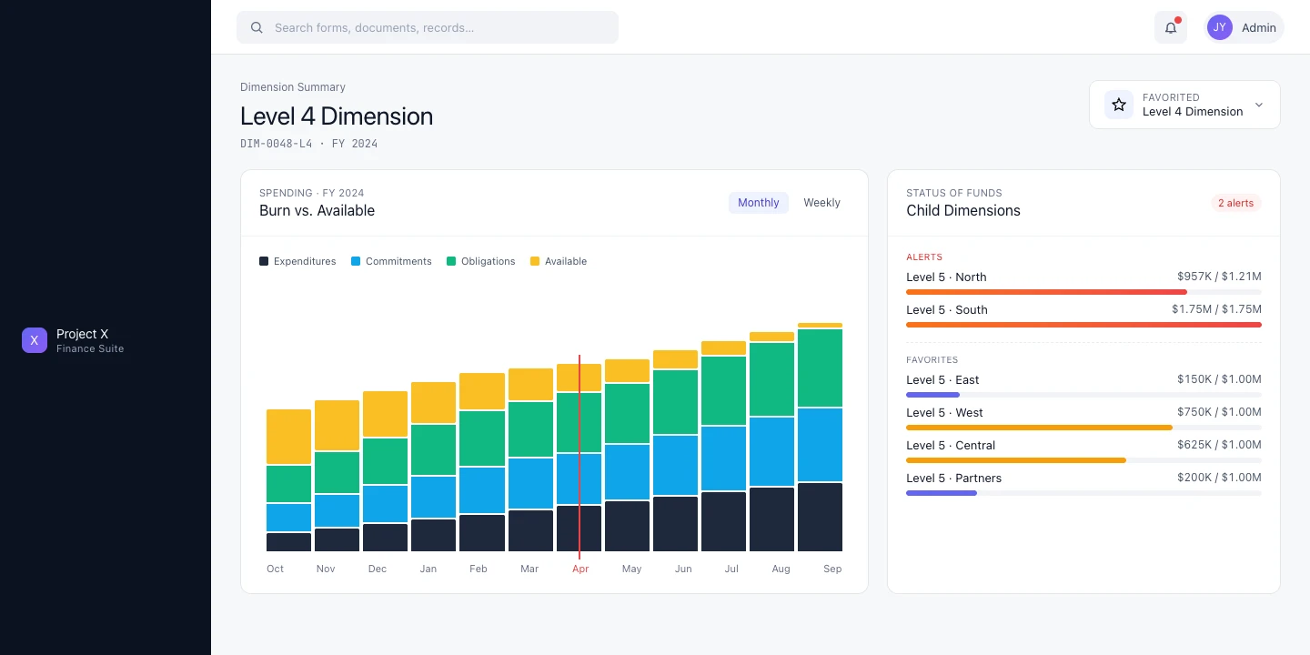
Dimension Summary — burn vs. available chart with child dimension status; drill-down without leaving the dashboard context
Sub-case 02 / 06
Transaction Matching · Three-Way Match · New Functionality
Automated Match — Obligation, Invoice & Receipt Reconciliation
Step 1 — The Problem
Federal acquisition involves a three-document chain: obligation (the commitment), invoice (the vendor’s bill), and receipt (confirmation of delivery). Matching these three is required before payment can be released — but there was no existing workflow for it. Users were doing this manually across disconnected records.
Step 2 — My Approach
The Automated Match Workspace organizes the work as a four-stage pipeline: Unmatched → Matched → Pending Payments → Completed. Status cards at the top give users immediate orientation to their workload. The unmatched records table below is filterable and actionable.
For each record, a Transaction Summary modal brings together all three documents — Obligation, Receipt, Invoice — in a single view with a Summary panel showing match status, exceptions, and the action to take. No more navigating between records.
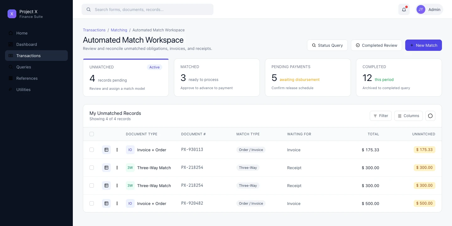
Automated Match Workspace — four-stage pipeline with status cards (Unmatched, Matched, Pending, Completed) and filterable unmatched records queue
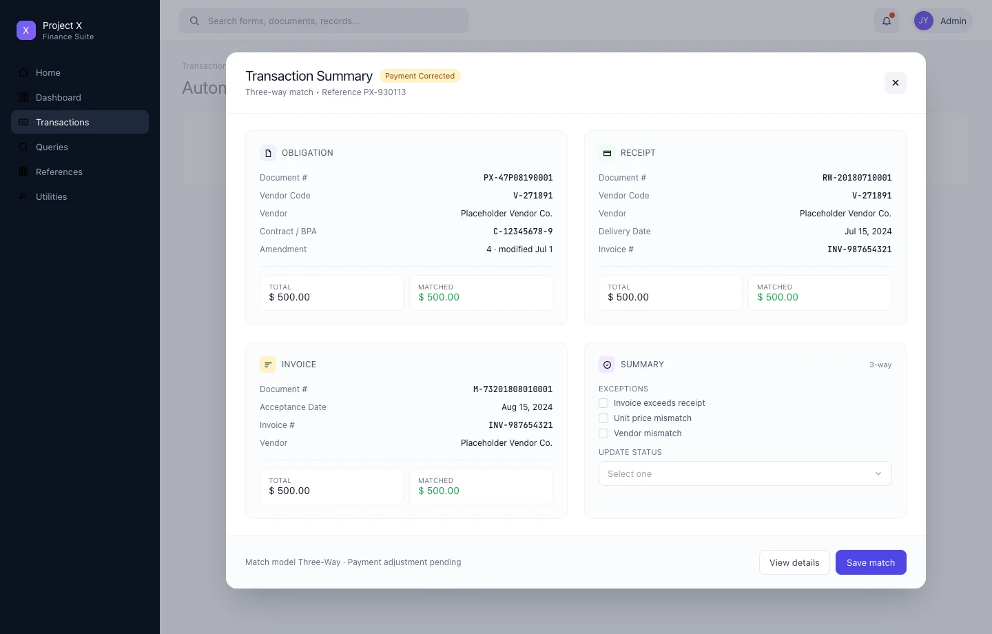
Transaction Summary modal — obligation, receipt, and invoice in one view; exception flagging and status update without leaving context
Sub-case 03 / 06
Credit Card · Hub-and-Spoke · Reconciliation Workflow
Credit Card Reconciliation — Purchase Card Charge Management
Step 1 — The Problem
Cardholders needed to reconcile purchase card charges to internal documents — matching charges to obligations, splitting charges across accounts, flagging disputes. The original approach put everything in a single large table, which collapsed under the complexity. Users couldn’t see what needed attention or what was already handled.
Step 2 — My Approach
The hub-and-spoke model: a workspace view shows the full picture at a glance — four status cards (To Reconcile, To Accept, To Approve, To Correct) each with counts and a plain-English description of what needs to happen. The table below shows only the relevant records for the active status.
Drilling into a charge opens a focused reconciliation flow: What do you want to do with this charge? Options: Reconcile Document, Dispute Charge, Split Charge, Mark Personal. Step 2 presents the matching documents. Clean, linear, no context loss.
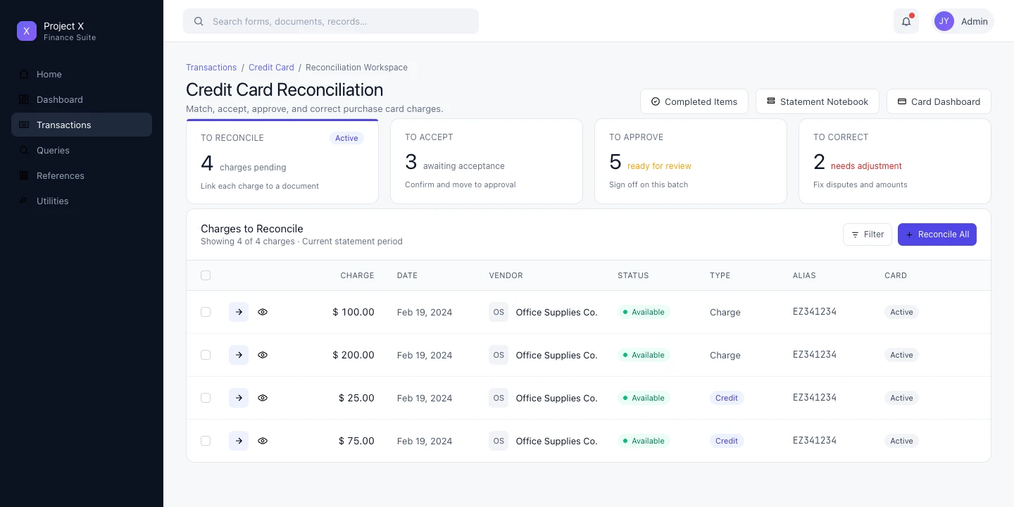
Reconciliation Workspace — hub-and-spoke status model showing To Reconcile, To Accept, To Approve, and To Correct lanes with live counts
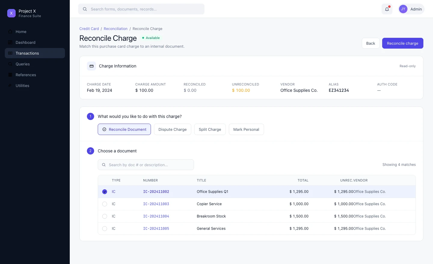
Reconcile Charge — numbered step flow: choose action (reconcile, dispute, split, personal) then choose the matching document; Split Charge option visible
Sub-case 04 / 06
Complex Forms · Information Architecture · Vertical Navigation
Itemized Request — Complex Document Management
Step 1 — The Problem
The Itemized Request is one of the most data-dense documents in the platform — line items with quantities, units, unit prices, and classification codes; funding sources that can apply to multiple lines; delivery schedules that link back to line items. The original design used 12 nested tabs to organize this. Users were constantly lost.
Step 2 — My Approach
Replaced nested tabs with a vertical navigation sidebar: General Information, Line Items, Funding, Deliveries. Each section is a dedicated view. The current location is always visible. Navigation is one click from anywhere.
The bigger design problem was bidirectionality: changes to a line item affect its funding; changes to funding affect what’s shown at the line level. The design had to surface these relationships clearly — not hide them in separate tabs that users had to mentally reconcile themselves.
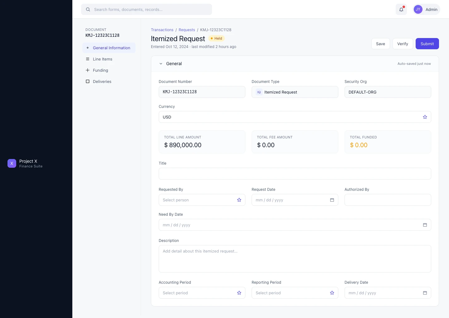
General Information tab — document header with financial summary (total line amount, fee amount, funded amount); vertical sidebar nav replaces 12 nested tabs
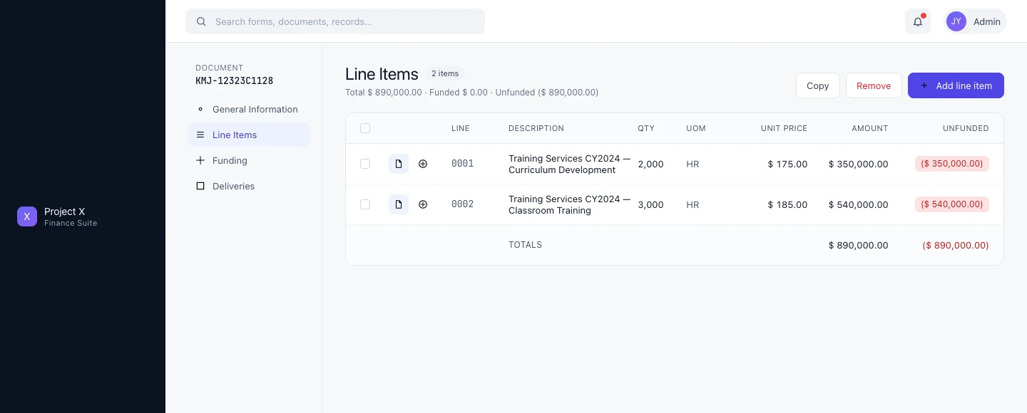
Line Items tab — line item table with quantity, unit price, total, and funded/unfunded status surfaced at a glance
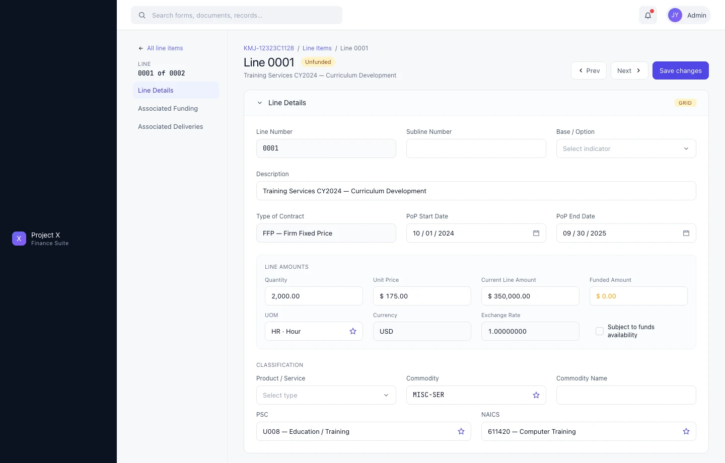
Line Detail — drill-down showing full classification, contract terms, period of performance, and accounting fields; the complexity the vertical nav was built to manage
Sub-case 05 / 06
Task Management · Team Workload · List & Card Views
Task Manager — Account Team Workload Coordination
Step 1 — The Problem
Account teams managing federal contracts needed a way to see, assign, and track tasks across their team — flagging what’s overdue, what’s assigned, what’s been completed. The platform had no native task coordination layer.
Step 2 — My Approach
Built over 6 months with a team of 5. The Task Manager is scoped to the account team: Team Tasks, My Tasks, My Assignments, Open, and Completed tabs give each user the view they need. Filtering by task type, assignee, or status surfaces priority items without hiding the full picture.
Two views: a table view for dense scanning, and a card view for task-level detail — description, due date, document count, label. The card view became the preferred mode for most users. Upon release, it received the highest user satisfaction scores of any feature in the program’s history.
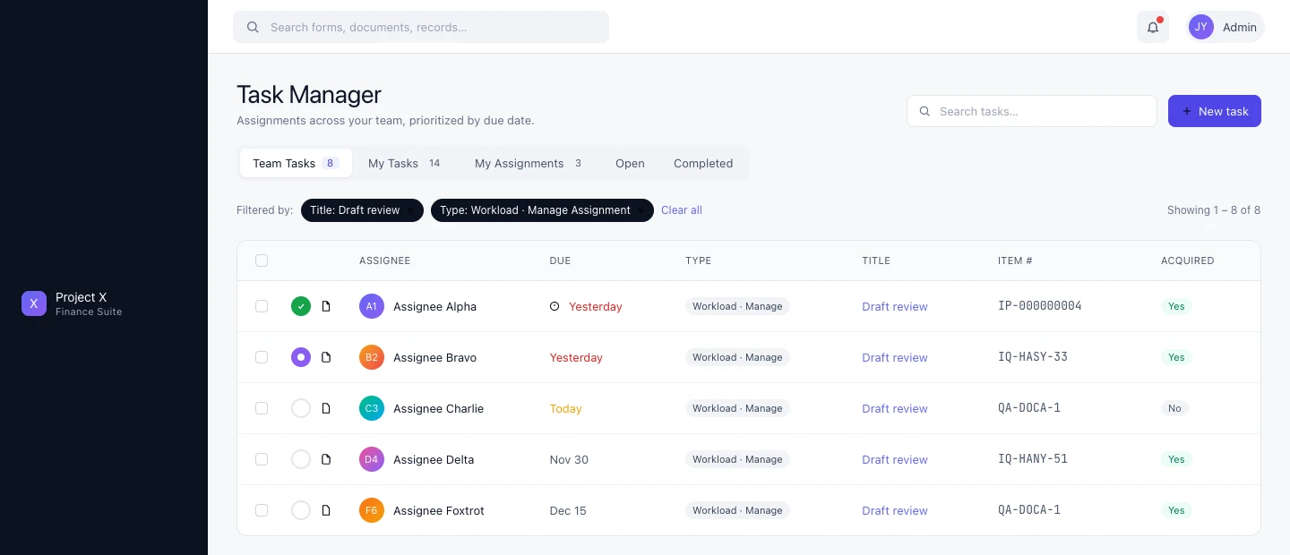
Task Manager list view — team tasks filtered by type and title; overdue items surfaced in amber; tab structure for team vs. personal workload

Card view — task-level detail with description, due date, document count, and label; the preferred mode for most users after rollout
Sub-case 06 / 06
Functional Team · Multi-Agency · Workload Intelligence
Task Inbox — Cross-Agency Contract Workload Management
Step 1 — The Problem
The Task Inbox addressed a different user — not an account team managing a single contract, but a functional team (contracts, finance, etc.) managing workload across multiple contracts and agencies simultaneously. The scope and complexity were an order of magnitude higher than the Task Manager.
Step 2 — My Approach
Designed approximately two years after Task Manager, in close collaboration with a senior designer and informed by multi-agency user sessions that defined the tab structure. The key insight from those sessions: users needed a workload intelligence layer at the top before they could usefully engage with individual tasks.
The result: six summary cards at the top of the inbox — Outstanding Obligations, Assigned Reqs, FPDs, Approvals, Other Actions, Aging Status — each showing a count, with Aging Status surfaced in red when items need immediate attention. Below: a filterable task table across all assigned contracts.
Tabs extend the model: Unassigned, My Tasks, My Workload, Forecast, Portfolio, Task Log — each representing a distinct use case for users managing complex multi-agency workloads.
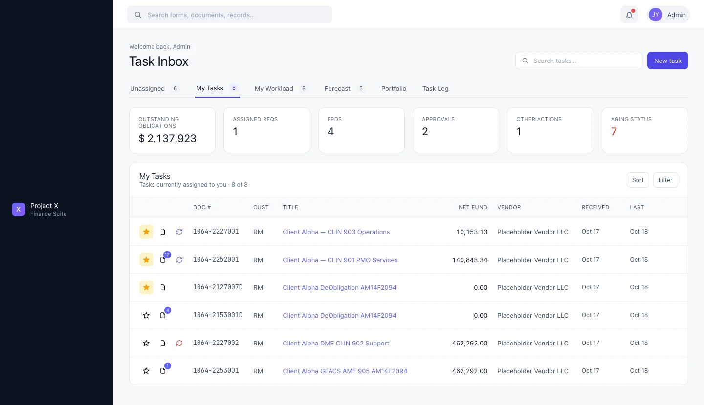
Task Inbox — workload summary cards (Outstanding Obligations, FPDs, Approvals, Aging Status) with full task table below; six-tab structure for multi-agency workload management
Want to walk through this in detail?
Happy to discuss any aspect of this work on a call — context, decisions, outcomes.